
Note
Go to the end to download the full example code
Image Segmentation via Spectral Graph Partitioning#
Example of partitioning a undirected graph obtained by k-neighbors
from an RGB image into two subgraphs using spectral clustering
illustrated by 3D plots of the original labeled data points in RGB 3D space
vs the bi-partition marking performed by graph partitioning via spectral clustering.
All 3D plots use the 3D spectral layout.
See 3D Drawing for recipes to create 3D animations from these visualizations.
import numpy as np
import networkx as nx
import matplotlib.pyplot as plt
from matplotlib import animation
from matplotlib.lines import Line2D
from sklearn.cluster import SpectralClustering

# sphinx_gallery_thumbnail_number = 3
Create an example 3D dataset “The Rings”.#
The dataset is made of two entangled noisy rings in 3D.
np.random.seed(0)
N_SAMPLES = 128
X = np.random.random((N_SAMPLES, 3)) * 5e-1
m = int(np.round(N_SAMPLES / 2))
theta = np.linspace(0, 2 * np.pi, m)
X[0:m, 0] += 2 * np.cos(theta)
X[0:m, 1] += 3 * np.sin(theta) + 1
X[0:m, 2] += np.sin(theta) + 0.5
X[m:, 0] += 2 * np.sin(theta)
X[m:, 1] += 2 * np.cos(theta) - 1
X[m:, 2] += 3 * np.sin(theta)
Y = np.zeros(N_SAMPLES, dtype=np.int8)
Y[m:] = np.ones(m, dtype=np.int8)

# map X to int8 for 8-bit RGB interpretation for drawing
for i in np.arange(X.shape[1]):
    x = X[:, i]
    min_x = np.min(x)
    max_x = np.max(x)
    X[:, i] = np.round(255 * (x - min_x) / (max_x - min_x))
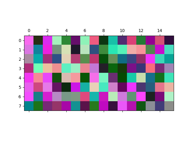
Plot the RGB dataset as an image.#
Each of the 128 3D data points can be treated as RGB values of a pixel. We illustrate the dataset plotting it as an image with 8x16 pixels, with the pixels randomly placed in the 8x16 grid. The fine structure in the data is not visually detectable in the image.
perm = np.random.permutation(X.shape[0])
rgb_array = X[perm, :].reshape(8, 16, 3).astype(int)
fig, ax = plt.subplots()
ax.matshow(rgb_array)
plt.show()
Generate the graph and determine the two clusters.#
The graph is constructed using the “nearest_neighbors” and the two clusters are determined by spectral clustering/graph partitioning.
NUM_CLUSTERS = 2
sc = SpectralClustering(
    n_clusters=NUM_CLUSTERS,
    affinity="nearest_neighbors",
    random_state=4242,
    n_neighbors=10,
    assign_labels="cluster_qr",
    n_jobs=-1,
)
clusters = sc.fit(X)
cluster_affinity_matrix = clusters.affinity_matrix_.H

pred_labels = clusters.labels_.astype(int)
G = nx.from_scipy_sparse_array(cluster_affinity_matrix)
# remove self edges
G.remove_edges_from(nx.selfloop_edges(G))

cluser_member = []
for u in G.nodes:
    cluser_member.append(pred_labels[u])
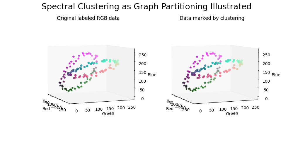
Generate the plots of the data.#
The data points are marked according to the original labels (left panel) and via clustering (right panel).
def _scatter_plot(ax, X, array_of_markers, axis_plot=True):
    # `marker` parameter does not support list or array format, needs a loop
    for i, marker in enumerate(array_of_markers):
        ax.scatter(
            X[i, 0],
            X[i, 1],
            X[i, 2],
            s=26,
            marker=marker,
            alpha=0.8,
            color=tuple(X[i] / 255),
        )
    if axis_plot == True:
        ax.set_xlabel("Red")
        ax.set_ylabel("Green")
        ax.set_zlabel("Blue")
    else:
        ax.set_axis_off()
    ax.grid(False)
    ax.view_init(elev=6.0, azim=-22.0)


# select the second half of the list of markers for better visibility
list_of_markers = Line2D.filled_markers[len(Line2D.filled_markers) // 2 :]

fig = plt.figure(figsize=(10, 5))
fig.suptitle("Spectral Clustering as Graph Partitioning Illustrated", fontsize=20)

ax0 = fig.add_subplot(1, 2, 1, projection="3d")
ax0.set_title("Original labeled RGB data")
array_of_markers = np.array(list_of_markers)[Y.astype(int)]
_scatter_plot(ax0, X, array_of_markers)

ax1 = fig.add_subplot(1, 2, 2, projection="3d")
ax1.set_title("Data marked by clustering")
array_of_markers = np.array(list_of_markers)[pred_labels.astype(int)]
_scatter_plot(ax1, X, array_of_markers)

plt.show()
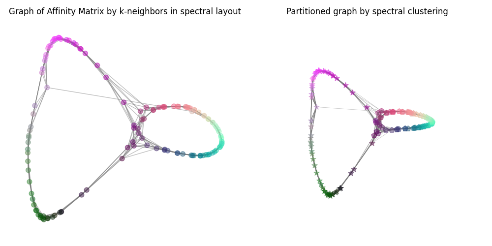
Generate the plots of the graph.#
The nodes of the graph are marked according to clustering.
# get affinity matrix from spectral clustering
weights = [d["weight"] for u, v, d in G.edges(data=True)]

fig = plt.figure(figsize=(10, 5))
ax0 = fig.add_subplot(1, 2, 1)
ax0.set_title("Graph of Affinity Matrix by k-neighbors in spectral layout")
pos = nx.spectral_layout(G)
nx.draw_networkx(
    G,
    pos=pos,
    alpha=0.5,
    node_size=50,
    with_labels=False,
    ax=ax0,
    node_color=X / 255,
    edge_color="Grey",
)
plt.box(False)
ax0.grid(False)
ax0.set_axis_off()

ax1 = fig.add_subplot(1, 2, 2, projection="3d")
ax1.set_title("Partitioned graph by spectral clustering")
pos = nx.spectral_layout(G, dim=3)
nodes = np.array([pos[v] for v in G])
edges = np.array([(pos[u], pos[v]) for u, v in G.edges()])
point_size = int(800 / np.sqrt(len(nodes)))


def _3d_graph_plot(ax):
    for i, marker in enumerate(array_of_markers):
        ax.scatter(
            *nodes[i].T,
            s=point_size,
            color=tuple(X[i] / 255),
            marker=marker,
            alpha=0.5,
        )
    for vizedge, weight in zip(edges, weights):
        ax.plot(*vizedge.T, color="tab:gray", linewidth=weight, alpha=weight)
    ax.view_init(elev=100.0, azim=-100.0)
    ax.grid(False)
    ax.set_axis_off()


_3d_graph_plot(ax1)
plt.tight_layout()
plt.show()
Total running time of the script: (0 minutes 2.389 seconds)